Brunch club.
BRIEF
‘Brunch Club’ was seeking a comprehensive branding package to establish a fun and energetic visual identity that appeals to their target audience of young professionals, families, and food enthusiasts seeking a lively brunch experience. The primary focus is on creating a captivating logo, and brand suite with application.
target audience
Age Group: Primarily targets individuals aged 25-40, including young professionals and families seeking a dynamic dining experience.
Behavioural Traits: Customers are willing to explore new culinary experiences and prioritise social interaction. They enjoy leisurely brunch outings and value aesthetically pleasing environments.
Psychographic Profile: Brunch Club's target audience appreciates quality food paired with a lively ambiance for social gatherings. They seek opportunities for relaxation and socialisation in welcoming settings.
Demographic Characteristics: Mostly median income citizens of families and working professionals. Most of the demographic would be sourced from urban areas working and living within the CBD.
Interests: Exploring diverse culinary offerings, Socialising with friends, family and colleges in a vibrant and welcoming dining atmosphere.
Competitor analysis
Competitor 1: Rise and Grind Café
Rise and Grind Café benefits from a prime location and a diverse brunch menu, supported by a strong social media presence with high-quality images and engaging content. Their cohesive and modern branding appeals to their target audience. Their social media strategy is highly effective, featuring regular posts with high-quality images and engaging content that attracts a large following. The café's branding is cohesive across platforms, utilising a modern and appealing aesthetic that resonates with their target audience. While their visual content is strong, it primarily highlights their brunch menu, potentially overlooking an opportunity to diversify their appeal. However, they focus less on bakery items, lack the vibrant ambiance of Brunch Club, and have occasional service inconsistencies that are mentioned in reviews.
Competitor 2: Sunshine Café & Bakery
This competitor excels with extensive outdoor seating, an eclectic international brunch menu, and regular live music events. However, they struggle with inconsistent quality in their baked goods, limited indoor seating for bad weather, and minimal social media marketing efforts. Their graphic design and online presence lack the engagement and reach necessary to effectively promote their offerings and events. Their visual branding is underdeveloped, with infrequent and low-quality posts that fail to capture the vibrancy of their in-person experience, resulting in limited online engagement and reach.
Competitor 3: The Daily Grind Café
The Daily Grind Café emphasises locally sourced ingredients and offers customisable brunch options for various dietary needs, along with active participation in community events. However, their graphic design and social media presence have shortcomings, including limited bakery items, a small social media following, and inconsistent branding and marketing efforts that fail to create a cohesive and engaging online presence.
Their visual content lacks consistency and creativity, resulting in a less compelling online presence that fails to effectively showcase their unique offerings and community involvement.
Conclusion:
These three competitors all have elements that pose great competition - however they are each laking in a field that Brunch Club can easily achieve through strategic content planning and creating captivating and engaging graphics that showcase the entirety of Brunch Club features to offer the public.
mood board
Initial mood board presented to the client based on the brief I have created a mood board to open up discussion for their brand aesthetic…. .
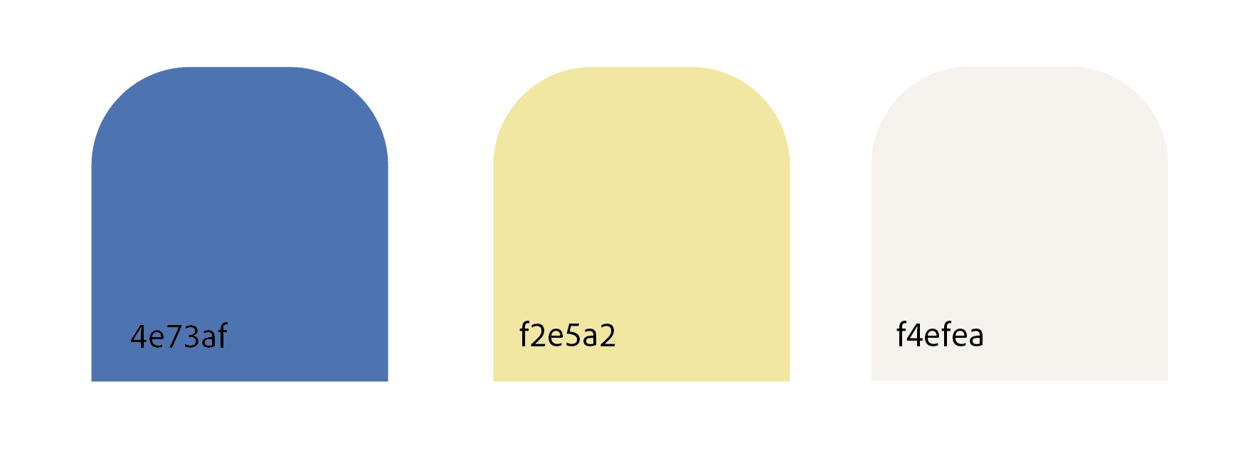
During the mood board presentation, the client approved the overall aesthetic. They requested the colour palette to be the pastel yellow and blue to reflect the coastal surroundings of the cafe location. They suggested they’d prefer a more simple style of illustration without humanistic characters / characteristics. These adjustments were made to align the project more closely with the client's vision and expectations
client check-in
creating the logo
Initial Logo drafts created according to the clients initial requests. Using playful fonts and beginning to incorporate ‘brunch - like’ elements.
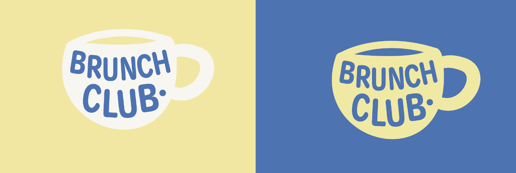
This initial draft was presented to the clients to condense the options to what they liked most. The Client provided feedback that they liked the boldness of the tea cup with the text inside creating a negative space effect. (see below).
After presenting a variety of logo options to the client, a favorite design was selected for further refinement.
The chosen brand colours were then applied to create a finalised version of the logo, ensuring it aligns perfectly with the client's vision and brand identity.
To provide a comprehensive understanding of how the logo and branding would look in real life scenarios, we created a signage mockup. This mockup demonstrates the logo's application, offering a realistic preview of its impact and effectiveness in action.
style guide
based on our discussion with the client i have concluded the following is appropriate for the brand:
Logo Design: Dynamic, eye catching logo that captures the essence of a fun brunch experience. Incorporate elements that represent brunch and bakery themes simply and creatively. Experiment with playful typography and colours to evoke energy and excitement. Ensure logo is versatile to be used across various marketing materials including signage, menu’s and merchandise. Logo’s must also be shared in all file formats (vector, png, jpeg, pdf)
Colour Palette: Utilise soft but bright colours that represent the coastal location of the business that also reflect and give the impression of a lively atmosphere.
Typography: Use playful and modern fonts that are easy to read and reflect the energetic, fun nature of the cafe. Incorporate a style of font that gives the impression of handwritten to add personality to the brand. Maintain consistency on typography across all branding materials.
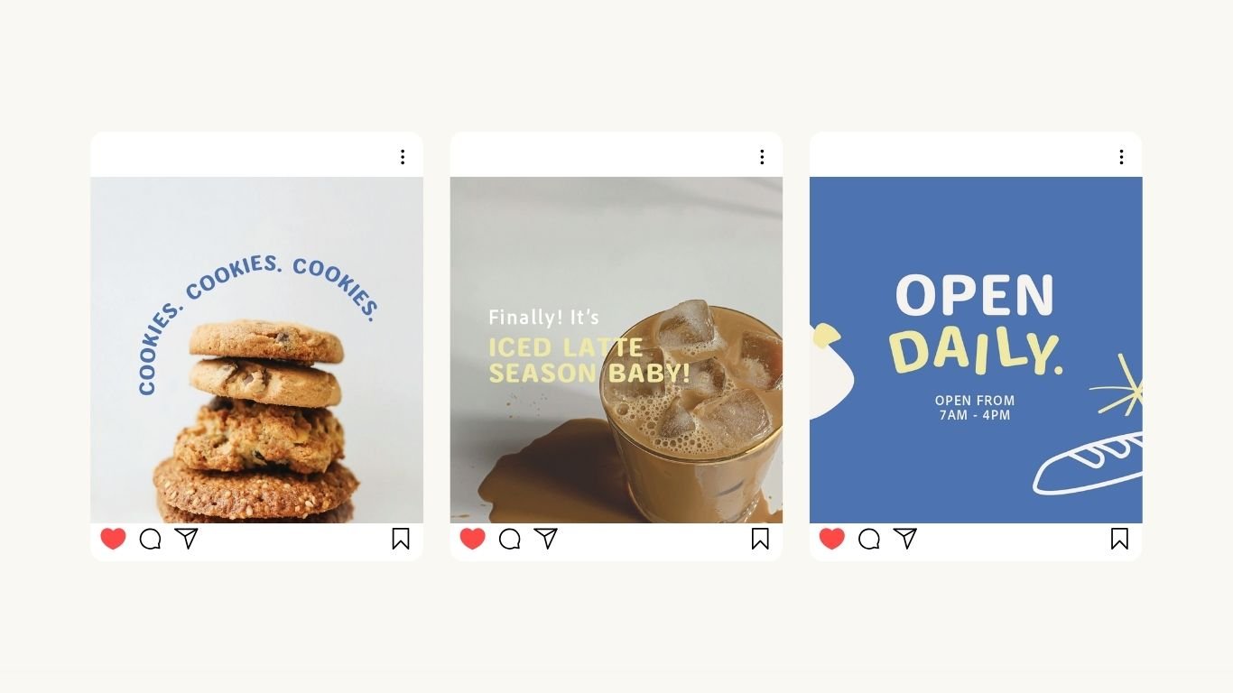
Branding Elements: Develop a series of assets including patters and illustrations that compliment the fun playful theme of the cafe. Ensure illustrations and patters are based on brunch related imagery. Ensure these are usable on all marketing materials - packaging, social media posts, promotional materials to create brand consistency and recognition.
Marketing Collateral: Design menu’s, loyalty cars that showcase the brands fun, playful personality and highlight it’s brunch and bakery offerings, while reinforcing brand consistency and recognition of brand identity.
Final Style Guide
Final deliverables
〰️
Final deliverables 〰️


